Kin Has A New Brand Identity And Messaging
The wait is finally over. After a week of daily countdown posts on r/kin, the kin team has revealed their new look, logo, messaging, and website. Let’s take a look.
Kin Has A Fresh New Logo

The kin team teased the new logo on day two of the countdown with a censored version in the top right corner.
Here’s a side-by-side view of the old logo v.s. the new logo.


The old logo was certainly recognizable at first glance. It prominently featured the capital letter “K” while evoking the shape of a jigsaw puzzle piece.
The new logo is modern while retaining the signature violet color. The hint of the letter “k” is there, but the triangle/hexagon pattern gives the illusion of a cube. No doubt, this is a nod to the underlying blockchain tech.
The Currency
Here’s a clever aspect of the new brand guidelines that ties into the contemporary hexagonal shape of the logo: just as most currencies have a symbol (e.g., $ for USD), kin encourages the use of the Unicode Black Hexagon “⬢” (U+2B22) character when referring to a quantity of kin. So, for example, “Send ⬢10,000.”
Kin Has Updated Their Messaging
Kin has sharpened its messaging to make it more appealing to a mainstream audience. From their blog post announcing the new brand:
Kin gives everyone skin in the game—making it easy for apps and brands to reward users and create exciting experiences with cryptocurrency, all while generating new streams of revenue for themselves. Tearing down barriers to crypto development, Kin is leading the Web3 revolution by empowering platforms and their users to forge mutually beneficial relationships. Win-win is a cliché—Kin is the reality.
Kin Ecosystem, 2022
What we see here is a reinforcement of Kin’s ideals. Kin has pushed a similar message for a while, but the new language is confident and social.
kin.org Has Been Completely Redesigned
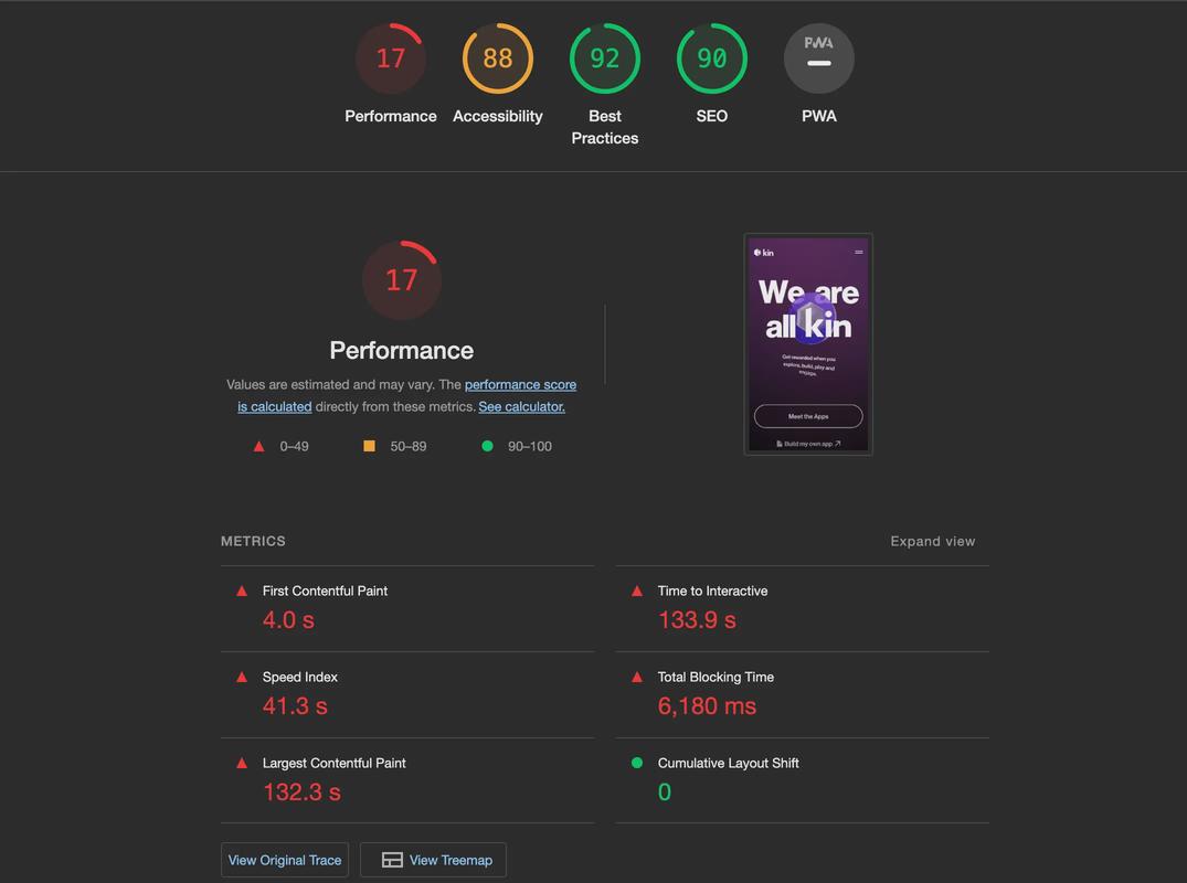
Looking at the new kin.org homepage, it’s immediately apparent that much time and effort was invested into designing an exciting, high-production-value experience—at least for desktop users. Unfortunately, the mobile experience leaves a lot of room for improvement.

Clocking in at a massive 53.6 MB of data, the performance on mobile really chugs. Even after the page is fully loaded, scrolling on mobile is choppy and unoptimized (at least on my Pixel 5a).
These issues aren’t dealbreakers, but they’re not presenting their best face until they resolve the sluggish mobile experience.
The Bullshit Network Take
I’m excited to see so much care and effort invested into the Kin Ecosystem. It’s crucial that the website, branding, and messaging stay relevant as the world grows to adopt more cryptocurrencies in their everyday lives.
Kin has been around for years, stalwartly enduring headwinds and slowly building towards something I think is quite extraordinary: creating better monetization strategies and value between creators and consumers.
Their new website needs some mobile love, but I’m genuinely impressed by the effort going into this project. I hope this new brand initiative fires up the community and invites more players to the ecosystem.


